InkTank
An app to explore inspiration for tattoo designs according to preferences like artist and style.
User Research, Competitor Analysis, Wireframes, Usability Testing, Prototyping

Understanding the Problem
To understand the problems I am trying to solve, I started by interviewing users who are thinking about getting their first tattoo and users who already have tattoos and are considering getting another one. I spoke to a demographic that uses technology for inspiration and when making decisions.
After my interviews, I discovered that our users need a way to explore inspiration ideas for tattoo designs and find capable artists because they want to feel confident in their choice of artist and design.
Competitive Analysis Process
To get a better understanding of what options my users had, I did thorough research on the top two tattoo related apps in the Play Store and Apple Store. The two biggest players are Tattoodo and InkHunter.


For each competitor, I researched and analyzed their market strategy, advantages, and completed a SWOT analysis for each. I also completed a UX analysis on their usability, layout, navigation structure, compatibility, and differentiation.
You can view my detailed analysis here.
Summary of competitive analysis
In summary, these top two apps each have features that set them apart and challenges that they could improve for a better user experience. While Tattoodo has great content, their screens are overwhelming and it’s easy to get lost. Though InkHunter doesn’t have as much content as Tattoodo, they struggle with navigation as well with no clear onboarding process and no tutorial to guide a user. Based on my analysis of both these apps, I decide I need to have a clear focus on clean, functional design for InkTank.
User Research
After learning about the different tattoo apps out there and analyzing the top competitors, I began to think through what I want my users to experience with InkTank. In order to ensure my designs solve real user problems, my next step was to dive into user research.
Research Goals:
- To understand what the user needs for a tattoo inspiration app
- To determine user pain points with existing tattoo apps
- To understand user behavior around the tattoo experience
- To help define necessary features for a tattoo app
- To determine which tasks users would want to be able to complete using a tattoo app
- To better understand the emotional experience of getting a tattoo
Conducting User Interviews
I had 5 questions about the use of apps and tattoos to qualify my users. I then created a script which included open-ended questions. I proceeded to complete 4 user interviews with 3 users who had tattoos and are considering getting more. 1 user does not have a tattoo but has been shopping around and gathering inspiration for a tattoo. Each interview ranged from 30 minutes to 1 hour and were all recorded video conference calls with permission of the users.
Beyond the interviews, I also published an online survey with 16 questions relating to the experience of getting a tattoo and using apps during the experience. I had 75 users complete the survey.
I compiled my notes from the interviews and surveys and documented insightful quotes, thoughts that I felt were important to my research, and listed them on digital sticky notes using the program Whimsical.

Highlights of user research findings
- Tattoos are not an emotional experience for everyone. For some people it is simply being artsy and trendy.
- Majority of users find their artists through referrals
- Social media has a major influence on users getting a tattoo and selecting a design
Personas
Creating personas is one of my favorite parts of user-centered design. I enjoy analyzing the data from my user interviews and surveys and prioritizing solutions based on user needs. Creating a persona ensures I am staying focused on the goals of my user throughout my design process. Using the data from my user research, I created two personas for the InkTank app. Each persona had their own demographics, behaviors, frustrations, needs and goals.
Hailey, 28, is the younger generation user influenced by social media and very tech-savy. Having a persona like Hailey helps me to design for users who use the internet when making decisions big or small, and keeps me focused on clean, user-centered design as tech-savy users tend to have less patience for apps that are not intuitive.
Erik, 36 is my user that has a strong knowledge of the tattoo industry, doesn’t care much about what others think, but does use the internet to do large amounts of research before making expensive decisions. A persona like Erik ensures that my features are designed with a tattoo-industry focus and encourages me to think through how I’m helping to inform my users to guide their tattoo decisions.


User Journeys and Mental Models
In order to gain deeper context of my users and better understand their experience over time, I developed journey maps for each of my personas.
In one scenario, Hailey is looking to get another tattoo and wants to use Inktank for design inspiration and to browse artists portfolios so that she can find a tattoo artist she is confident in. Because she’s active on social media, she likes the idea of being able to share the designs she’s interested in with her followers and friends for opinions.
Thinking through Hailey’s journey for this specific scenario, I think about the tasks she will need to complete and how she will feel about each task which helps me to uncover opportunities for features in my app.
I follow the same process for my second persona, Erik, to capture another set of tasks and emotions from a different type of user.
To ensure that I am understanding exactly what the users want to accomplish, I then create mental models for both personas.


Designing and Prototyping
Now that I have a deep level understanding of my different types of users, I am ready to begin designing!
I first start with creating my Sitemap.
For my design, I knew I needed an Explore tab (Home) and wanted to include a Favorites and Profile tab as well. My Home is where users will search and browse through tattoos and artists, Favorites are where the boards will live, and Profile would be settings and other items that are specific to the user.
To see if I was on the right path, I used a digital card sorting test via Optimal Workshop and asked 7 people to participate. My goal was to determine if the hierarchy was intuitive to users.
Learnings
From the results of my card sort, I learned that the structure was easy for users to understand. I also learned there was a need for a Messages tab. Users were unsure where to go to send/read messages from an artist.
After refining my sitemap, I moved onto sketching my first wireframes for the design.
Wireframes
Once I finalized the navigation hierarchy and design patterns, I start sketching the screens for each tab:
- Explore/Home
- Favorites
- Messages
- Profile.
I also design for the top features that are most important to my personas:
- Searching for tattoos and artists
- Saving favorite images
- Creating boards to organize saved images
- Inquiring with an artist

Searching for Tattoos or Artists (Explore/Home Screen)

Saving a Favorite Image and Creating a New Board
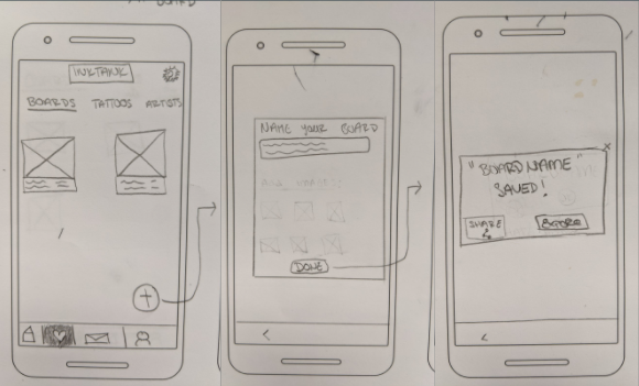
Create a New Board from Favorites Screen
After sketching out a couple versions, I use the program Balsalmiq to create mid-fidelity wireframes. This method helps to get an overall idea of how my design will be laid out.

Searching for Tattoos or Artists (Explore/Home Screen)

Saving a Favorite Image and Creating a New Board
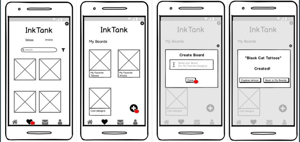
Create a New Board from Favorites Screen

Inquire with an artist
Now that I’m comfortable with the look of this design layout, I use the program Sketch to design high-fidelity wireframes for the first prototype I will use to test features and usability.
Prototyping
To create my first prototype, I design for an Android device and used the template in both Sketch and Invision. I designed screens for:
- Explore/Home, Favorites, Profile, and Messages tabs
- Searching for tattoo designs and artists
- Saving a favorite image
- Creating a board to organize saved images
- Inquiring with a tattoo artist
- On-boarding Experience

On Boarding Screens

Artist Search Screen and Inquiring with an Artist
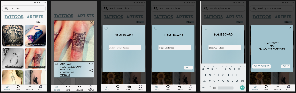
Tattoos Search Screen and Saving an Image to Create a New Board
User Testing
Test Method: Moderated Remote Tests (due to sessions happening during Covid-19)
Test Plan: Since this is an early stage prototype, I decided that the remote test would be helpful to test ease of use and navigation on the app. It will be helpful to observe the user, note how they complete each task, test for intuition and note their frustrations.
To prevent a user from feeling awkward about being observed, I prep the users with as much insight as possible about how the test will go and what I am hoping to learn. I allow users to test using their own devices so that they are as at ease as possible.
Test Script: After laying out my test plan, I write a test script for my scheduled user tests. I include a detailed introduction of what kind of test they are participating in, demographic and background questions to qualify the user, and read out the scenarios and their corresponding tasks. I ensure the user is comfortable, understands what is being asked of them, and let them know that they are free to ask me questions at any point.
You can view the test plan and test script in detail here.
Usability Test Sessions
For the usability test sessions, I used FaceTime and Google Hangouts for video conferencing. After reading through the test script, I had participants pull up the prototype on their mobile phone. Participants would face their laptop camera towards their mobile phone as they were walking through the prototype.
I recorded each session using Quicktime with the permission of the participant.

Highlights from usability testing sessions:
- Every participant enjoyed the on-boarding experience, though I made a note that some felt the images of the screens were unnecessary.
“Quick, simple, and I like that I could have skipped if I wanted to.”
- Some users had trouble knowing where they were on the Home/Explore screen. They seemed to be confused about whether they were looking at a Tattoos results page or a results page for Artists. Note to make sure the Tattoo and Artist tabs are more prominent in the next reiteration.
- Every participant thought the flows were straight-forward and completed each task with no help from me.
- Two users mentioned that it would be nice to have the option to be able to add an attachment file on the message inquiry to artists.
- Users liked the Pop-Up Screen during each flow (sending a message, creating a board) but as my users asked more questions about content, I realized I could fit more content if I designed for a detailed screen vs a pop-up. I noted this for the reiteration.
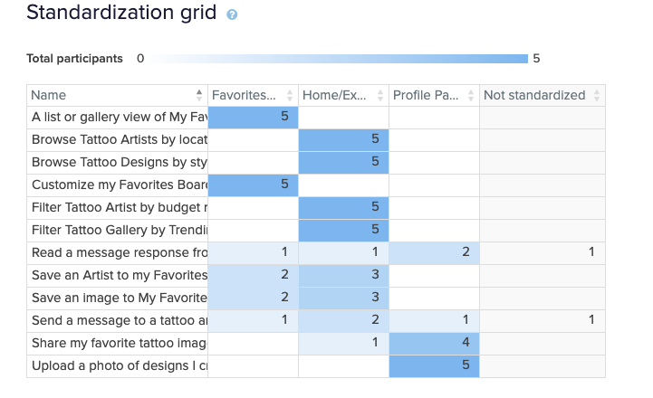
Sorting through the data
To organize all the data I had collected from my 6 testing sessions, I categorized my observations using the Affinity Map Method. This helped me to see patterns good and bad.

After categorizing my observations and errors, I used a Rainbow Spreadsheet to further rank and prioritize where my focuses should be going forward. This method helped me to not only see the patterns that needed immediate fixing, but also gave me good momentum resulting from understanding my users even better and seeing what they enjoyed about the design.


Reiteration
Once I sorted through the feedback and prioritized my observations, I was ready to make updates to my design!
Four main focuses for my design reiteration:
- Adjusting the hierarchy on my Explore Screen to drive focus and engagement on the image results
- Adjust the Headers when unselected (so users know where they are, tattoos or artist screen)
- Moving from pop-up screens to detailed screens for the Action features (such as sending a message, saving an image, creating a board)
- Create new on boarding screens that still inform a user the capabilities of the app but doesn't dilute screens with unnecessary content

On boarding screens

Searching for Tattoos (Explore/Home Screen)

Searching for tattoos by style
Saving an image to Create New Board

Searching for artists (Explore/Home Screen)
Artist Profile Screens
Sending artist a message

Saved Screen (Boards)
What's next for InkTank?
InkTank has been a fun challenge as I spent a lot of time researching an area I know nothing about, the tattoo industry! I spent hours on the phone and video calls testing different users and interviewing them about them their experiences which I feel ultimately helped me design a great solution for users wanting to explore designs for tattoo inspiration and discover tattoo artists.
The next phase of InkTank:
- Add a community discussion area where users can ask questions and feedback
- Integrate with a Maps feature to discover artists by location
- Book artist via app to keep up with competition
- Enhance UI
You can view a demo of the latest prototype here.
Thank you!
Thank you!
